Designing a Website that Converts
How Websites Can Influence Your Decision Without You Knowing
Have you ever ordered something in a restaurant only to instantly regret as soon as the waiter skirts off with the menus? Asking yourself why you ordered that, you don’t want that? It’s no surprise because we all have. Our brains are bad at interpreting the information our bodies provide us. We may have cravings, but the most sophisticated interpretation we can really make of hunger is that we need fuel, sustenance. The rest is open to cues and abuse from marketing, psychology and our surroundings. Marketers know how we process information and have established some rules that are known to convert more customers.

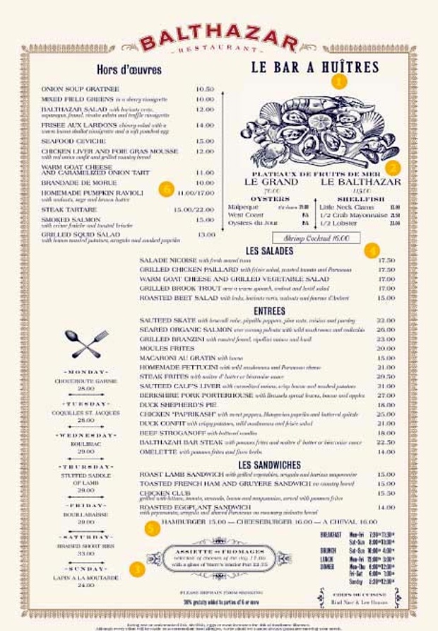
One of the most common examples of these marketing tricks is a menu. Restaurants know how we interpret their information and position their menu items accordingly. There are certain positioning techniques and psychology that make us interpret the menu in the way they want. The menu is like a maze that is trying to rattle you through to not the most expensive items, but the most profitable. It steers you unknowingly to what seems like a combination of good value and what you want, when in reality items that are best for the restaurant
Dishes are categorised in four ways, as:
- Stars - both popular and profitable.
- Puzzles which are high profit but unpopular
- Plough Horses - popular but unprofitable
- Dogs - unpopular and unprofitable.

In this example, we can see how the top right corner is devoted to an expensive and profitable item. It’s where our eyes are drawn first. By positioning the most expensive dish here, the rest of the menu then appears cheap by comparison. It is this that will allow you to inflate the price of a popular dish and it still sell well.
Websites operate on many of the same principles and these need to be understood in order to get people to book on your site. Our eyes move in familiar patterns and we’re conditioned into processing information in a certain way. Websites have to be built to direct people through them in a way that leads them towards purchasing. From WebdesignerDepot:
When someone lands on a page within a website, there are certain things they expect to see right away, pretty much regardless of the kind of site they’re on. If they don’t see these things, they often feel as if they've ended up in some strange wasteland that doesn't make sense to them (and therefore, isn't trustworthy).
So, how can you set-up your site in a way that looks ‘right’ and leads people to the properties that you want them to book?
Firstly, categorise your properties. Just as in the example of the restaurant, understand which profits bring you the most profit, which are popular but don’t draw in as much profit? Knowing where the profit lies is the first step in deciding how to position your website.
Feature your star properties in prominent positions. They should be the first properties your customers see. People generally process a website in a “Z” style pattern. They start in the upper left corner, move across then cut down and across the page before moving across the bottom of the page. The edges of the page are almost dead zones and are not the place to feature properties you want to promote. Use your underselling properties. If you have a luxury property that is expensive and not selling, use it as a counter-weight to make others seem cheap by comparison. You place a lower price, but high-profit property next to this high priced property. It then seems cheap by comparison.
One tip we can take directly from menu psychology is to avoid long lists of prices. Let desire take over. If you list prices in an easy to compare manner, you lead people to choosing the cheapest option, not their favorite. You can, however, use pricing to your advantage. In the menu above, they use a small and a large size, both priced differently. This is done to make the large option seem far better value and by buying the small, you are wasting money. A way to apply this technique is to offer a weekly price that is lower than 7 total nights. This can be enough to push people from staying 4 or 5 nights into taking the entire week. Not only does this generate more revenue but it also avoids leaving awkward gaps in your booking calendar.
All of Kigo’s websites are built with this website psychology in mind. Our templates are structured to get bookings from vacation rental guests. You just fill them with your own content and properties.
Our custom websites can then be built with our design team to your exact specifications. A well-made custom site is both delicate and effective. They don’t confuse or overwhelm, but simply guide the visitor through the best properties and towards the booking process. Click here to learn more about getting the perfect site for your business.


